Currently leading Product Design at sevdesk ↗

Design × Product
Max Tillich


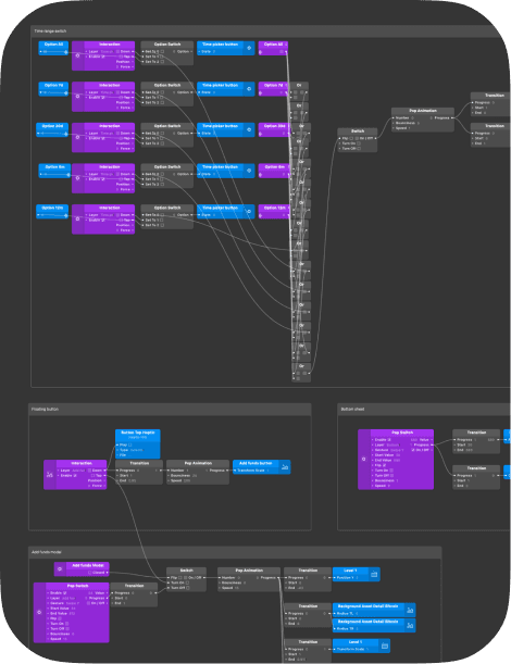
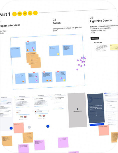
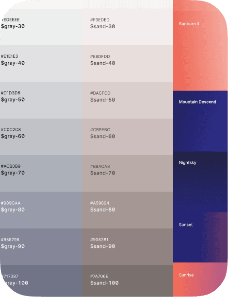
Redesign & Design System

Accountant Mode

Agentic Accounting

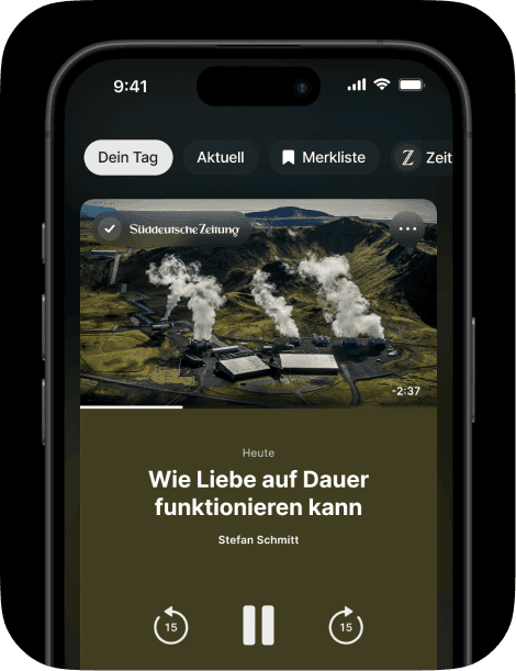
New Mobile App

Command Pallette
Leading product design at sevdesk across growth and core domains. I shaped product & design vision, drove a company-wide redesign, the new app and led horizontal initiatives across Growth, Core & Tax Advisors. Introduced a token based Design System, adopted across all touch points.
2023–Today · Scale-up (exit) · Manager → Director

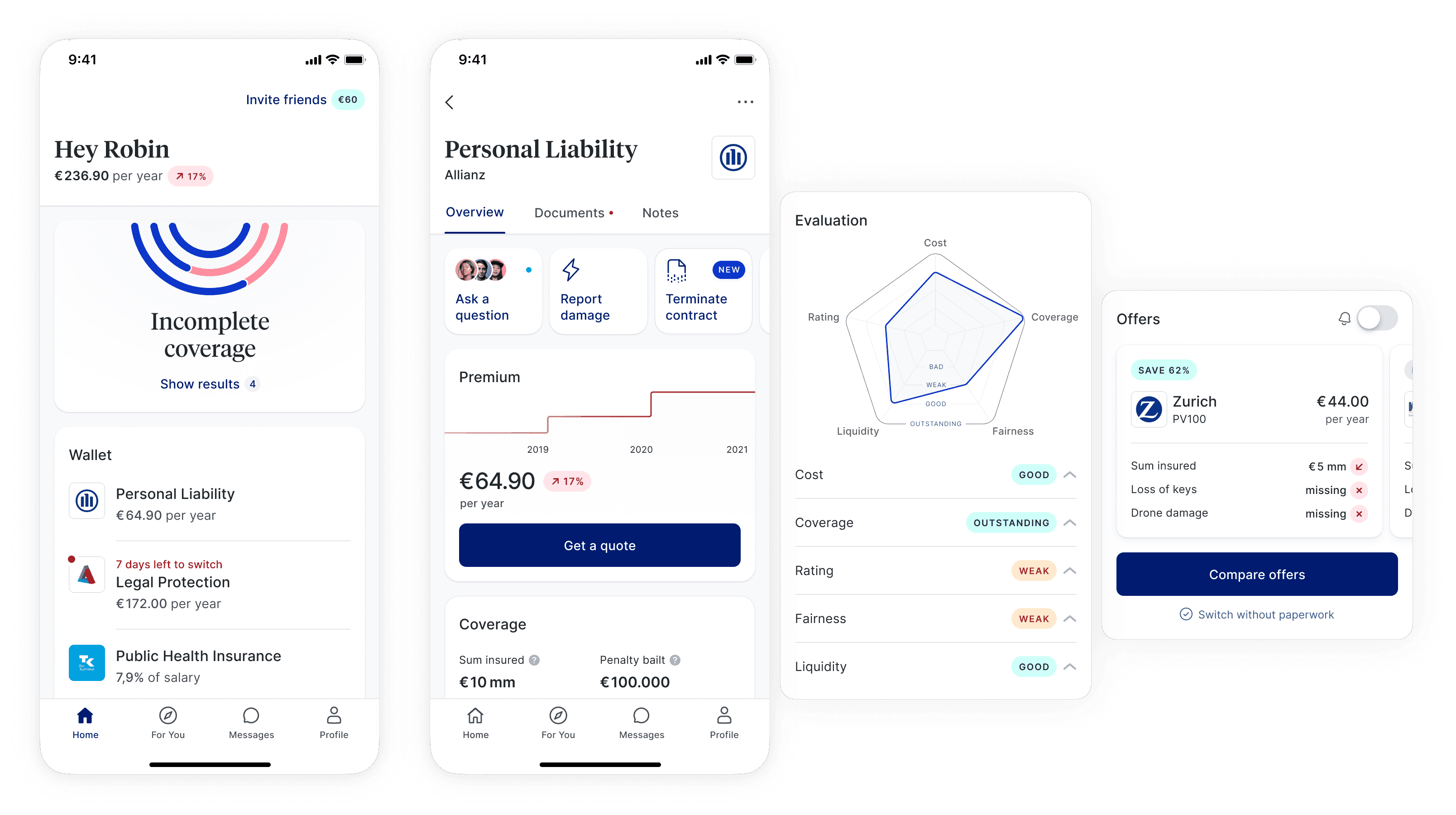
Redefined the first mile and core experience of CLARK’s smart insurance wallet. Informed by insights from usage and qualitative data, I designed experiments and vision prototypes in close collaboration with Product and Engineering leads, leading to increased retention and a positive impact on sales.
2021–2023 · Scale-up · Senior → Lead


I led the pivot of our jargon-free Bitcoin micro investing app to become an engaging savings product. We democratized access to dynamic interest rates on decentralized markets that get a boost for bringing friends.